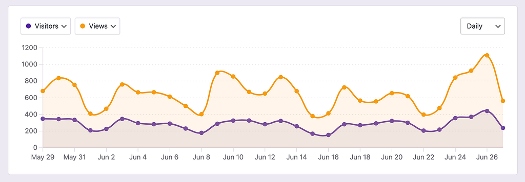
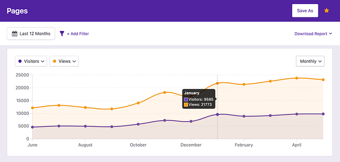
By default, it will display your Visitors and Views:
If you click on the first dropdown, you’ll see that you can display any of your site’s metrics:
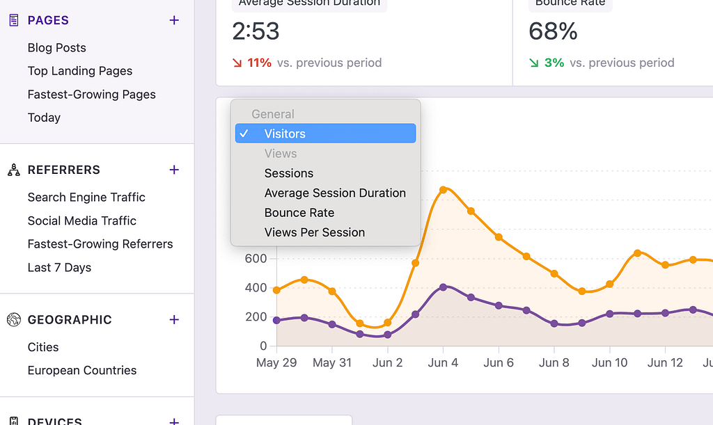
Pro users can also select metrics from WooCommerce and forms.
If you select the second dropdown, you’ll have access to all the same metrics, plus the option to display nothing at all, allowing you to view just one metric in the chart.
The axis on the left corresponds to the first metric and the axis on the right to the second.
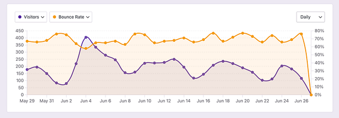
Lastly, if you save the report, your changes to the chart will be saved as well.
When you first view the analytics dashboard, it displays data from the last 30 days, and the chart uses a daily interval.
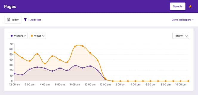
However, if you change the date range, the chart interval will automatically adapt. For instance, if you change the date range to Today, the chart will switch to an hourly interval:
If you switch to a date range with more than 90 days, the chart will switch to a monthly interval:
While the chart changes its interval automatically, you can also edit it manually with the interval select:
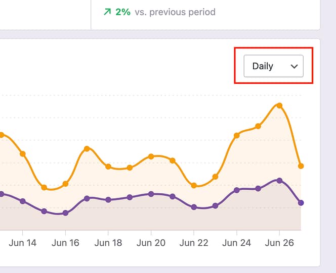
You can select between the following four intervals:
Hourly
Daily
Weekly
Monthly
You can choose any of these intervals manually, regardless of the current date range.